MP vote map
For your convenience, this is a tool for interactively navigating the space of MPs clustered by their voting records. We've taken just the votes of every MP, done some maths, and plotted a map. The axes are made automatically by the maths. Read more about this below.
Usage instructions: Click and drag the mouse pointer in the image to drag, zoom, or select from the space. (Click on the radio buttons at the bottom marked "Drag", "Zoom", or "Select" to determine the mode.) Zooming happens if you drag the mouse pointer right or left. The panel on the right shows the list of MPs. Selected names are highlighted in white in the image. Warning: when you select from the image with the circle pointer, you may get more than one MP, and you will have to scroll through the list to see them all.
Not working? If you are able, download Sun's Java software. On Windows, the old unsupported Microsoft versions of Java will not do. Alternatively, get a taste with a static 2010 screenshot, 2005 screenshot, 2001 screenshot or 1997 screenshot of the clustered MPs.
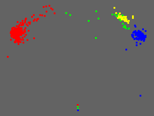
MP vote map 2010 parliament
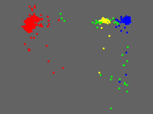
MP vote map 2005 parliament
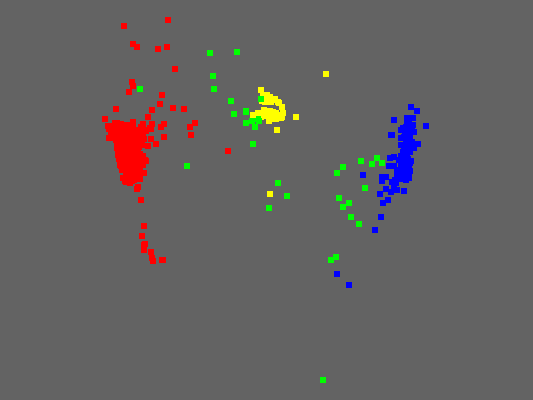
MP vote map 2001 parliament
MP vote map 1997 parliament
What is cluster analysis?
Cluster analysis is a technique used by scientists who have measured comparable features of a set of similar objects, and need to group them into categories. The objects can be anything from homonid skulls, to beetles, to fossilized grass seeds. The features can be forebrow size, leg length, or spikiness. Usually, there are very many features which are all compared at once. They are multiplied and reduced down to one single dissimilarity measure. We invent a formula that decides, for example, that this skull is 0.97 skull units different to that skull, according to our measure.
We can use computational techniques to simulate a spring network between all the different skulls in the collection. If the two skulls are placed too close together, according to the dissimilarity measure, they are pushed apart; if they start are too far apart, a force pulls them together. The computer calculates the positions of the skulls in space to minimize the strain in the spring network.
If all has gone well, and we have chosen an appropriate dissimilarity function, the skulls in the collection will group into clusters which probably correspond to one species. The clusters will be in bigger clusters, which may or may not correspond to a genus, and so on.
Since the dissimilarity measure is arbitrarily chosen, and experimentally altered to make better results, it takes further proof to be sure that the clusters are significant and not a mistake due to the way you are measuring at it.
How is this cluster analysis done?
We've chosen a dissimilarity measure which depends on the number of votes the same way, and the number of votes against one another, between two MPs when they both vote in the same division. If every time two MPs vote in the chamber they always vote the same way, their dissimilarity measure is zero. If they always vote on opposite sides, when they both vote, their dissimilarity measure is one. The actual function is: [Number of votes on opposite sides] / [Number of divisions in which both voted].
Our cluster analysis calculation was done using Multi-Dimensional Scaling. The mathematics behind this is available in many textbooks, and on the web. The calculation itself, as opposed to the proof that this calculation gives what you want, is reasonably simple to describe. Although most people won't understand it, it's important to mention it openly in case they do.
It ought to be a rule that the public does not accept any computational result unless the computation is itself publicly available. The analogy between computer algorithms whose output has a bearing on, say, government policy, and the law, is close. We do not tolerate being subject to laws that are secret and unpublished, regardless of whether we understand them; we can hire a lawyer if we don't. The same should be true with computational results which can sometimes hide a great many errors and fudge factors that should not be present.
Multidimensional scaling. First step: write the dissimilarity measure as a symmetric matrix: 650 MPs along the top, 650 MPs down the side. The dissimilarity measure between MP1 and MP99, say, is the same as the dissimilarity measure between MP99 and MP1, which is why it is symmetric. The matrix also has zeros down the diagonal.
Factorize this symmetric matrix into its diagonal form of an orthogonal matrix, times a diagonal matrix of eigen values, times the transpose of the orthogonal matrix. This is one of those fundamental matrix operations discovered by mathematicians hundreds of years ago, and taught in first year college maths degrees. The first two columns of the orthogonal matrix, scaled by the square root of the corresponding eigenvalues, are the coordinates of the points in the map. In practice, we can choose any number of dimensions, or columns, to make the clusters in multi-dimensional space, but, in this case, two dimensions give a good picture.
What do the axes mean?
This is the most popular question.
The axes don't mean anything. Here's why:
The diagram is generated to represent the closeness of the voting patterns. MPs who usually vote the same way are plotted close to one another, and MPs who usually vote far apart are plotted further distant. You can reflect this map across a line, or rotate it through any angle, and the distances between the points will be no different. The meaningful axes you're looking don't necessarily have to be horizontal or vertical. We've kept this orientation of the picture because it fits on the screen nicely.
There can also be distortions in the angles between the clusters. If the Tory party voting pattern moved close to Labour, for example, the axis between the Labour cluster and the LibDem cluster would rotate counter-clockwise to bring the Tories closer to one rather than the other.
I would guess than any meaning you do see in the axes are subjective, post-hoc observations. Distances are important, not the directions. You should pay no attention to them.
I am not a believer in those Left-Right/Libertarian-Authoritarian political diagrams on which I've seen analysts attempt to plot people's political views. This type of analysis is, I think, more of a tool of persuasion than of sociological measure. The idea that you can nail your opinion to some point on a spectrum, and someone else can read out your personal set of policies from its location, is worse than professional astrology. Each person's set of preferences will depend on personal experience, expertise, reasoning, and hearsay. We are all so different with regards to the input of these factors. It's not probable they would fit into a philosophically pre-determined spectrum.
Perhaps some sort of survey and cluster analysis will suggest a different, realistic pattern. But the measurements will be too confounded by the persuasive nature of policy tables having done their work already. Such a survey would have to work from behavioural data, rather than stated opinion polls.
One very good critique of our current electoral system is that it depends entirely on the self-measurement of human opinion. Human beings are notorious for holding opinions that are systematically at odds with even their own reality (eg to ask: "How many units of alcohol do you think you drink a week?"). Policy spectrums, which this cluster diagram is emphatically not, are an easy way to influence political opinions by bundling policies up -- ones which you do like, together with ones you don't fully understand and probably wouldn't like if you did -- and getting you to pick from them. In practice, influencing opinions are far easier for many politicians and vested interests to do, particularly for ones not immediately in power, than to make changes to reality.
The election game, which puts the public's battered and misdirected opinion at a higher level of importance than any sociological measure, is clearly treated as a sport by the professional players.
Why is Tony Blair and his cabinet so far away from the rest of his party?
I suspect it's because they mostly show up to votes which tend to be on contentious issues when many MPs are rebelling. This gives them a higher than expected dissimilarity measure than if they turned up to all the non-contentious votes when there was no rebellion. They show up during these contentious issues in order to encourage their MPs to vote the way they want; the rebellions could have been larger had they not shown up.
The impression that they are pulling their party away from its centre of gravity, in the way that the leaders of the other parties are not, is probably correct.
What are the green dots?
We've coloured the MPs who are not in the three big parties green. These parties don't have enough MPs to form colourful clusters; it's for aesthetic reasons, rather than anything we have against these smaller parties, that they are all lumped together. You can, however, click on the individual members to find out pretty quickly that the Welsh and Scottish national party members tend to associate with the LibDems, while the Ulster parties tend to align with the Tories.
Any future developments?
We've tried a few experiments, such as subselecting for votes on particular issues, and calculating the pattern for a three-month sliding window and animating it through time. Neither produced very enlightening results, so we've not bothered to publish them.
The pattern per parliament is reasonably stable and consistent. In fact, it's a much better result than you normally get from cluster analysis of any kind. I think these diagrams are about as far as it goes with this, and they are not bad. If you would like the data in a form you can play with in your own cluster analysis software, then you download it on our Raw Data page.
2004-02-06 Chris Lightfoot did just that, and has generated very interesting cluster graphics using principal component analyis. This differs from our distance-metric based clustering, by instead rotating a multidimensional space so the 2D projection you see has the maximum variance across it. Full details, pictures and political commentary can be found in Chris's blog entries "Which Parliamentary co-ordinate are you?" and "Nontraditional political movements". Chris's analysis enables him to work out what the axes mean, and draw pictures of how MPs move between the last two parliaments. Go have a look.
More of the same? Try our Ministerial Whirl